
MASTER BRAND GUIDE · 2026 EDITION
CONFIDENTIAL · INTERNAL + AGENCY USE
Steelhaus Technologies Inc. · Master Brand System
Steelhaus primary brand logo
The Iron Standard. Forged in Canada.
A complete reference for how the Steelhaus master brand looks, sounds, and shows up in the world.
Document · SH-BRAND-MASTER-2026
Scroll to begin
1,000 People · 1,000,000 sq.ft.
01 · FOUNDATION
Who we are, in plain terms

We Built
The Floor.

Steelhaus is a Calgary-born completions and manufacturing institution. From a 10-person shop to 1,000 people across 20 locations, we forge the iron, write the engineering, and run the field. The master brand carries that authority. Everything in this guide protects it.

1,000+
People
Engineers, machinists, field hands, and operators across North America and the Middle East.
1M ft²
Manufacturing Footprint
In-house steel, plugs, screens, energetics, and shared infrastructure across the Steelhaus group.
600k+
Stages Completed
FracXion, ReacXion, Precision, Ball Drop systems anchoring the most aggressive programs globally.
30+
Countries
From the Montney to the Middle East. One crest. One iron standard.
20
Locations
Manufacturing, R&D, and field operations.
10 yr
From 10 to 1,000
A decade of compounding capability. The brand has to keep up.
Pillar I
Scale
Our footprint is your insurance. Bigger isn't bragging; it's certainty.
Pillar II
Capability
We own the engineering, the forge, and the field. No outsourced answers.
Pillar III
Reliability
Built for the realities of a three-mile lateral. Field-proven, every time.
Pillar IV
Edge
We're a heavyweight that still pushes the envelope. That's why this works.
Master Positioning
Steelhaus is not a vendor. We are the iron standard the world's most complex wells depend on. We earned that title the only way it counts: in the field, under load, when the pressure is on.
02 · THE MARK
The crest is the contract

One Mark.
One Voice.

The master brand uses a single, untouched lockup: the Steelhaus crest (red and blue swirl in a steel ring) paired with the STEELHAUS wordmark. No descriptor underneath. No sub-text. No slogans crowded against it. This is the corporate signature.

Steelhaus primary brand logo, crest with wordmark, reversed for dark backgrounds
Primary Lockup · Reversed

The Master Mark

The crest sits left of the wordmark with a clear-space gap equal to the height of the crest's outer ring. This is the only configuration approved for master-brand use. Divisions extend; the master never adds a tagline beneath the crest.

RULE 01 · CLEAR SPACE
Give the crest air
Minimum clear space on all sides = the height of the crest's outer ring (≈ the cap-height of the letter "S"). Nothing (typography, photography, edges) enters that zone.
RULE 02 · MIN SIZE
Don't shrink past legibility
Print: crest no smaller than 12mm tall. Digital: 32px height minimum. Below those, drop the wordmark and use the crest-only mark.
RULE 03 · INTEGRITY
Logo is sealed
Per Shane's directive: no slogans, sub-text, or graphics above, below, or directly next to the crest. The mark stands alone. Campaign lockups live in headlines, not on the mark.
✓ DO
  • Use the master mark on calm, controlled backgrounds: solid ink, charcoal, or paper.
  • Reverse to all-white when placed on photography, video, or color fields.
  • Lead with the color crest in print and presentation; reverse to white-on-black for cinematic / Iron-campaign contexts.
  • Use the crest-only mark for app icons, social avatars, vehicle door decals, and embroidered apparel.
✗ DON'T
  • Don't stretch, rotate, or recolor the crest. Red and cyan stay red and cyan.
  • Don't add taglines, drop-shadows, or outlines to the master mark.
  • Don't place the mark on busy or low-contrast imagery without a dark scrim.
  • Don't combine the master mark with a division wordmark in a single lockup.
  • For brand marks, use the logo file. Don't recreate STEELHAUS in CSS or split its color. Inline mentions of Steelhaus in body copy or naming conventions are fine.
03 · COLOR
Forged from iron, lit from the inside

Red. Cyan.
Iron. Fire.

The palette is built on duality: Ignition Red and Precision Blue live inside the crest. They sit on a foundation of matte midnight charcoal and raw iron greys. Forge Orange is the campaign accent. The spark, the heat, the proof. Click any swatch to copy its hex.

Ink
HEX#050608
RGB5 · 6 · 8
CMYK75 · 68 · 67 · 90
ROLEMaster Canvas
Raw Iron
HEX#1F2329
RGB31 · 35 · 41
Steel
HEX#5A6068
Ignition Red
HEX#C8102E
RGB200 · 16 · 46
CMYK15 · 100 · 90 · 5
PMS186 C
Precision Blue
HEX#00A7C4
RGB0 · 167 · 196
CMYK76 · 11 · 19 · 0
PMS313 C
Forge Orange
HEX#E84E1B
RGB232 · 78 · 27
CMYK5 · 80 · 95 · 0
PMS172 C
Deep Red
HEX#7E0F1C
Deep Cyan
HEX#006B82
Bone
HEX#D6D7D9
Paper
HEX#F2F2F0

Usage Ratio · 60 / 25 / 10 / 5

Ink + Iron
60%
Steel + Bone
25%
Ignition Red
8%
Precision Blue
5%
Forge Orange
2%
04 · TYPOGRAPHY
Two faces. One locked logotype.

Heavy on Top.
Honest Below.

Barlow Condensed is the master brand's title font. Nine weights, condensed industrial character, open-source license (SIL OFL) with no caps and no tiers. Use it for every headline, section title, and tactical lockup. Univers Next Pro Condensed carries everything else: body, specs, captions. The brand uses only the condensed family (Light, Regular, Bold). Univers Next Pro upright is not part of the master brand system. Magistral Black is reserved exclusively for the STEELHAUS logotype. It lives inside the logo and nowhere else. When Univers is not installed, the ladder is fixed: Aptos Narrow in Word and PowerPoint, Barlow Semi Condensed on the web, Arial Narrow as the floor. The licensed face is the standard; the ladder defines what happens without it. Balboa is the campaign display face, by design: it appears only in flattened campaign artwork produced by the creative team via Adobe Fonts, never in live documents. Scarcity makes campaign pieces feel like events.

PRIMARY DISPLAY · HEADLINES & TITLES
BARLOW CONDENSED
Jeremy Tribby · Google Fonts · SIL Open Font License · Free for commercial, web, app, and digital ad use
ABCDEFGHIJKLMNOPQRSTUVWXYZ
0123456789
ExtraLight · 200 · set sparingly Regular · 400 · sub-headlines Medium · 500 · section titles SemiBold · 600 · primary headlines Bold · 700 · ExtraBold · 800 · hero impact
SECONDARY TEXT · BODY & SPECS
Univers Next Pro Condensed
Linotype · Adrian Frutiger / Akira Kobayashi · Condensed family only · Light Cond · Cond · BoldCond
ABCDEFGHIJKLMNOPQRSTUVWXYZ
0123456789
Light · large body, editorial Regular · running body copy Medium · emphasis SemiBold · labels Bold · call-outs, key terms
LOGOTYPE ONLY · DO NOT TYPESET
STEELHAUS wordmark
Magistral Black · ParaType
Magistral Black is the typeface inside the STEELHAUS wordmark. It belongs to the logo and nowhere else. Do not set headlines, body copy, captions, slides, or any other live text in Magistral Black. The TTF is included strictly so the logotype can be rebuilt faithfully when the wordmark needs to be recreated. For all headline work, use Barlow Condensed.

Hierarchy & Specimens

H1 · Hero
Barlow Cond SemiBold · 72–280px
Tracking -1.5%
THE AUTHORITY OF IRON
H2 · Section
Barlow Cond SemiBold · 44–92px
Line 0.95
Forged Not Found
H3 · Sub
Barlow Cond SemiBold · 24–28px
Tracking +2%
Built for the Realities of the Field
Eyebrow
System mono / Univers Next Pro BoldCond
11px · Tracking +22%
01 · SECTION KICKER
Body
Univers Next Pro Cond Regular · 15–17px
Line 1.55
Steelhaus owns the engineering, the forge, and the field. We re-tool and re-deploy in hours, so a design change never stalls your pad. That is what scale buys you: certainty when the lateral pushes back.
Caption
Univers Next Pro Cond Light · 12px
Tracking +4%
Fig. 04 · Hydraulic Coil Sleeve mid-stage, Montney basin · 2025
05 · VOICE
How Steelhaus sounds out loud

Confident.
Specific. Real.

We speak like the company that sets the standard, because we do. Confidence is proof, not posture: every claim of strength lands on the customer's certainty, never on our rank over the field. No begging. No buzzwords. No em dashes. Every sentence pulls weight.

01
Authority Over Promotion
Speak as the company that sets the standard, not one trying to be considered. Replace "we strive to" and "we aim to" with "built to" and "engineered for."
02
Clarity Over Complexity
Short, sharp, structured. Lead with impact, not background. Cut every word that isn't pulling weight.
03
Strength Over Softness
Active voice. Strong verbs. Concrete nouns. Never passive, never hedged. Strength aims at the well, never at the room.
04
Real Capability Over Hype
Numbers, locations, names, results. "Revolutionary" and "game-changing" are banned unless we can prove it on the floor.
USE · HeavyweightAVOID · Mid-weight · Chest-beating
Standard · Earned authority · ProofRank · Apex · Dominate
Fortress · Platform · InfrastructureFacilities · Shop · Operation
Insurance · Certainty · AnchorSolutions · Services · Offerings
Forged · Mastered · Built from the floorCreated · Developed · Provided
The Iron StandardQuality products
Holds the fieldCommand the field · Field support
Engineered for the extremesDesigned to perform well
Respect isn't given. It's forged.
In the lateral, our size is your insurance.
Physics doesn't negotiate. We engineer for that.
We didn't build a company. We built a fortress for your supply chain.
Built in Canada. Proven everywhere.
Our tools don't come from a catalog. They come off our floor.
The recalibration in practice · Iron campaign, January vs June 2026

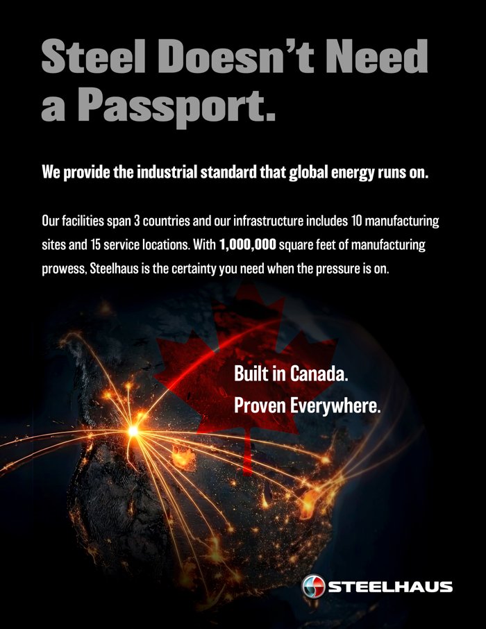
Same visual system, same proof numbers. The difference is where the strength lands. The January copy claimed rank over the field; the June revisions land on the customer's certainty. The campaign has run its course; these pairs stay in the guide as the reference standard for all future creative.
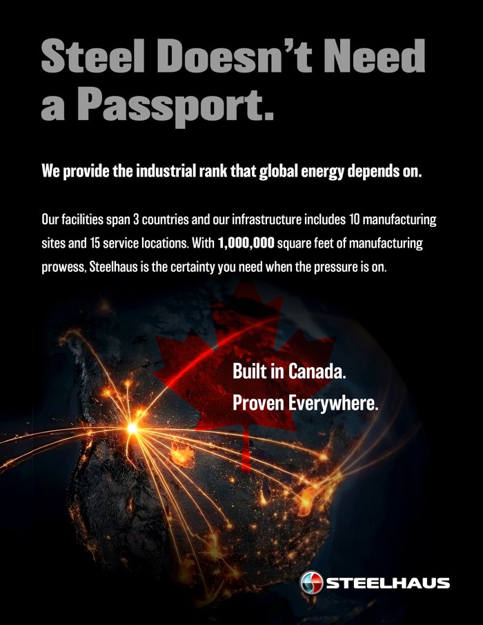
Before · "the industrial rank that global energy depends on"
JANUARY · RANK-ANCHORED
Passport ad, before
After · "the industrial standard that global energy runs on"
JUNE · LANDING RULE
Passport ad, after
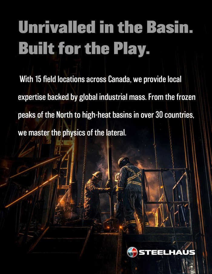
Before · "Unrivalled in the Basin"
FEBRUARY · RANK-CLAIM
Basin ad, before
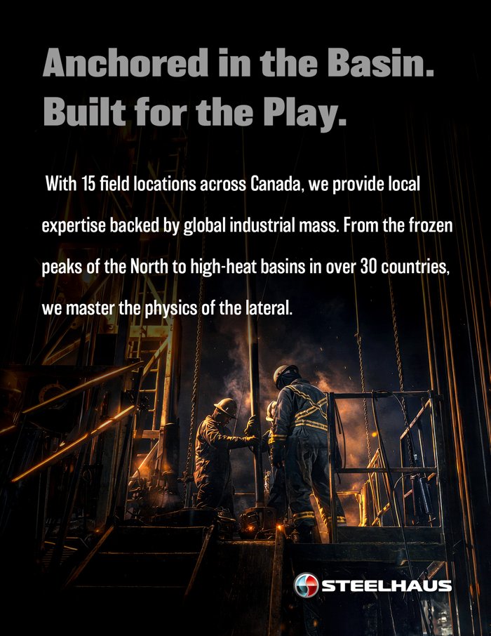
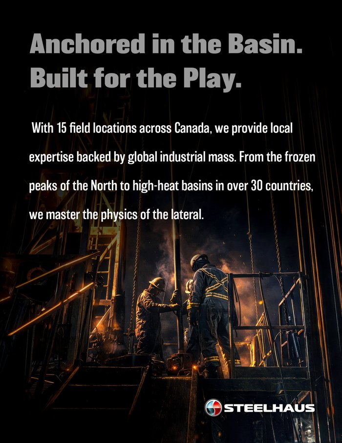
After · "Anchored in the Basin"
JUNE · LANDING RULE
Basin ad, after
06 · ARCHITECTURE
Master brand, division extensions

One House.
Many Specialists.

The Steelhaus crest is the constant. Divisions extend the master mark by adding their wordmark beneath. Never beside, never in place of. The crest is shared property. Division typography and accent treatments belong to the division. The corporate voice belongs to Steelhaus Technologies Inc.


MASTER BRAND
Steelhaus Thermal
DIVISION · 01
Steelhaus Thermal
High-temperature completions for SAGD, CSS, and thermal-recovery plays. Accent: thermal-haze grey.
Steelhaus Energetics
DIVISION · 02
Steelhaus Energetics
Shaped charges, perforating, and downhole energetics. Accent: spark-red lightning glyph.
Steelhaus Tryton
DIVISION · 03
Steelhaus Tryton
Frac sleeves, packers, and Canadian completion systems. Accent: maple leaf badge.
Steelhaus Technologies Inc
PARENT COMPANY
Steelhaus Technologies Inc.
The corporate face. Brochures, capability decks, investor materials, and master-brand communications.
  • Master mark = crest + "STEELHAUS" only. No descriptor. Used for corporate, capability, investor, and Authority-of-Iron contexts.
  • Division marks = crest + "STEELHAUS" + division wordmark beneath, separated by the wordmark baseline. Treat the division wordmark like a chapter title, not a tagline.
  • Never combine two division marks in a single lockup. If a piece spans divisions, default to the master mark and reference the divisions in body copy.
  • Division accents (Thermal haze, Energetics spark, Tryton maple) belong only to division creative. Master-brand pieces use the core palette only.
  • Co-branded partner pieces follow a 1:1 height parity rule with a 2× crest-height clear-space rule between marks.
Shane's Logo Integrity Rule The Steelhaus logo remains untouched. No slogans, sub-text, or graphics above, below, or directly next to the crest. Campaign lockups (e.g. "THE AUTHORITY OF IRON") live in the layout. Never welded to the mark.
07 · APPLICATIONS
Brand in the wild

In Ads.
On Trucks.
On Hard Hats.

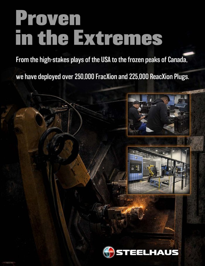
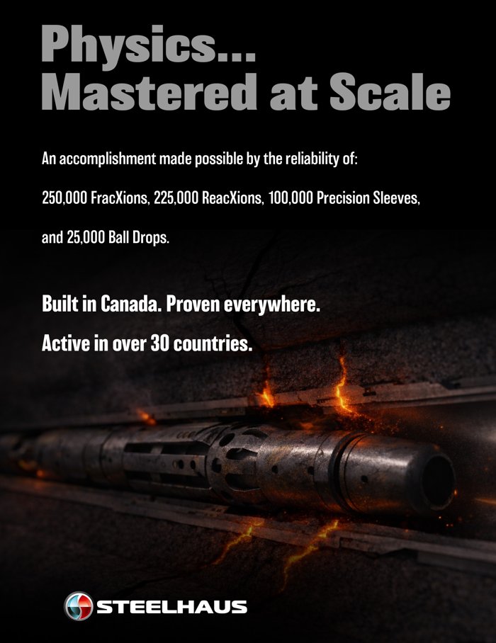
Three reference applications of the master brand. Two are tactical ads from the 2026 Authority of Iron campaign, paired with a current Steelhaus business card to show the corporate identity at print scale. Each shows the master brand operating with discipline: matte-black canvas, condensed headline, master mark anchored without taglines or sub-text. These ads are shown for their visual system; their copy predates the June 2026 voice recalibration. New campaign creative follows the rev 2 language directive: strength lands on the customer's certainty.
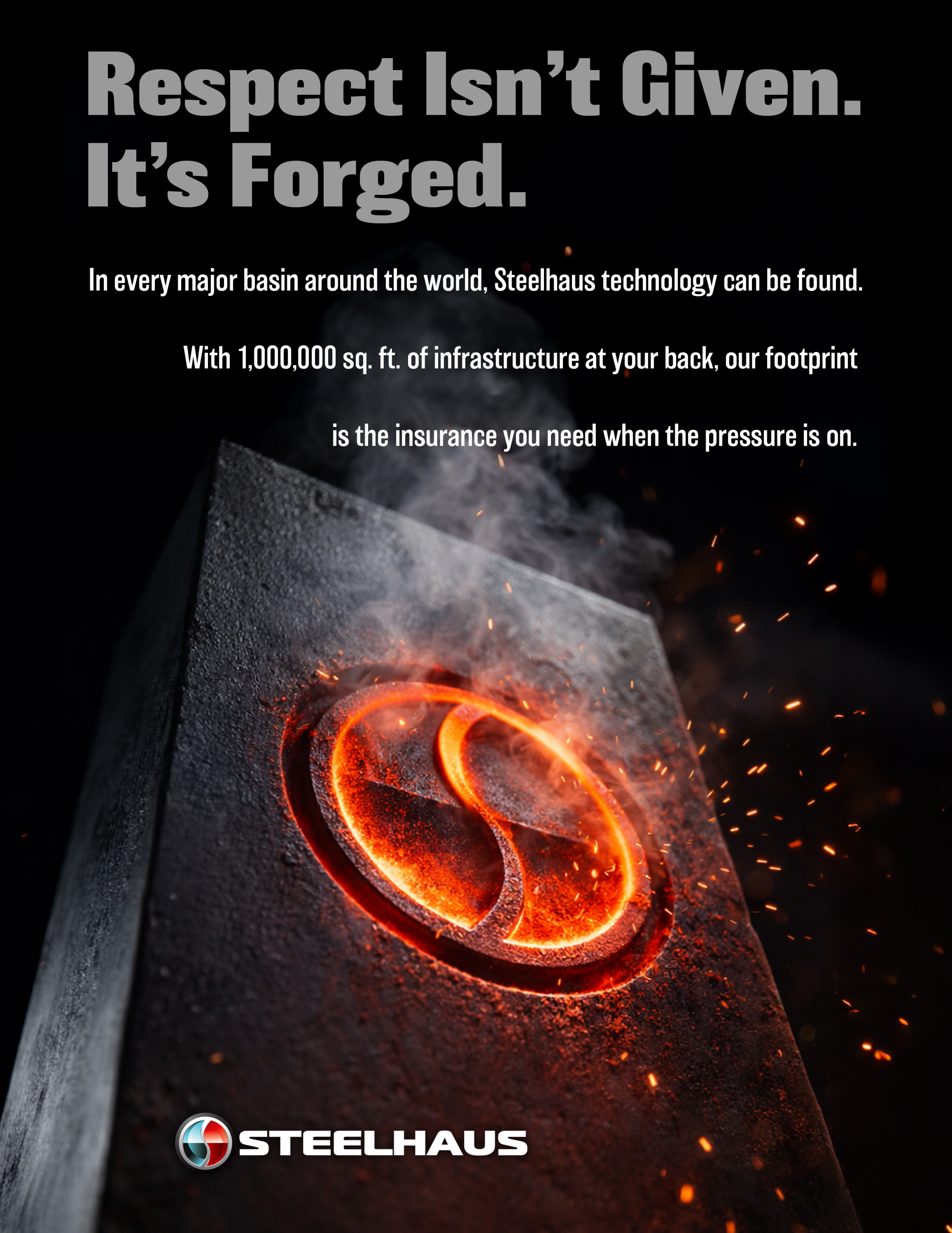
Respect Isn't Given
Respect Isn't Given
LINKEDIN
Anchored in the Basin
LINKEDIN
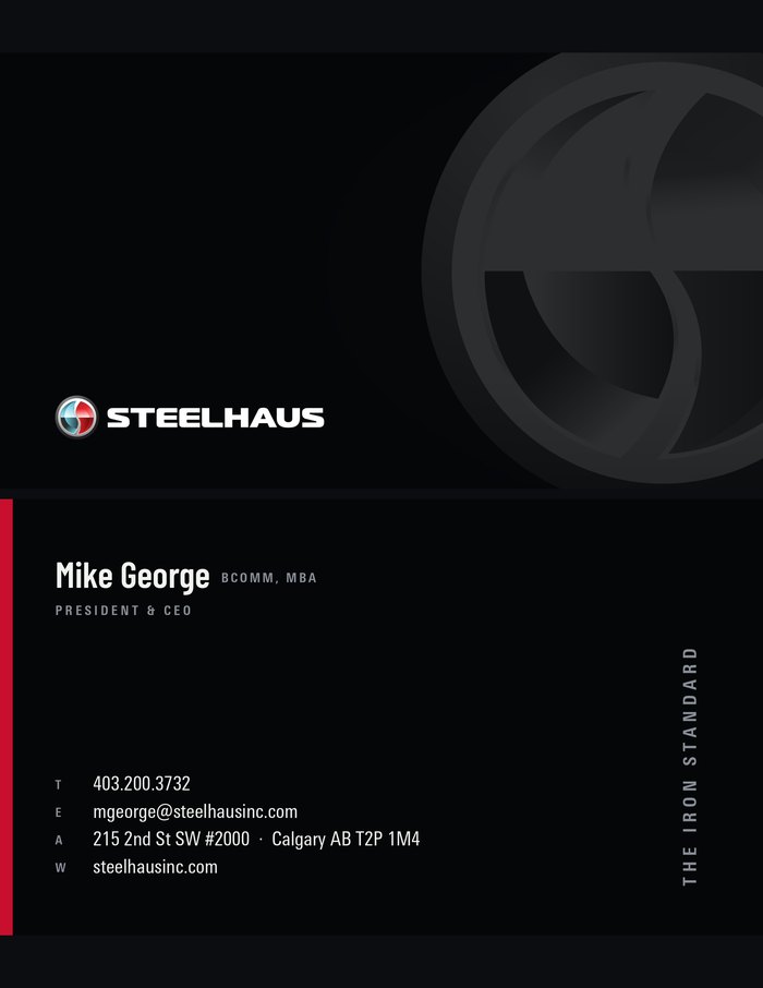
Business card
Business Card
PRINT
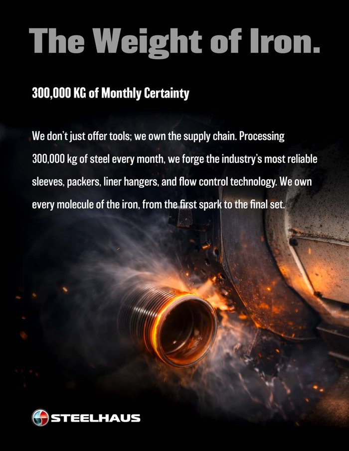
The Weight of Iron
The Weight of Iron
LINKEDIN
Proven in the Extremes
LINKEDIN
Physics Mastered at Scale
LINKEDIN
A1
Business Cards
Matte black 32pt. Master lockup + blind spot-UV crest front. Contacts and red spine back. PMS 186 C painted edges.
A2
Vehicles & Decals
Crest-only on door panels. Full lockup on tailgate. White-on-black or color-on-white. Never on grey.
A3
Apparel & PPE
Embroidered crest on chest. Wordmark on back / sleeve. Hard hats: vermilion shell + crest decal.
A4
Social & Digital
LinkedIn: 1080×1080 / 1080×1350. Barlow Condensed headline, matte-black canvas, forge-orange accent. Avatar = crest only.
A5
Letterhead & Tech Sheets
Master mark top-left. Univers Next Pro body. Footer carries division mark + ISO statement. Use existing background plates in Logos/{Division}/Background.
A6
Signage
Brushed aluminum substrate, deep-cut Barlow Condensed wordmark, illuminated crest. Minimum 600mm width.
A7
Trade Show
Black backdrop, oversized crest, headline at eye height. Iron-campaign forge-orange permitted for booth lighting only.
A8
Email Signature
Crest only · 40px height. Name in Inter SemiBold 14px. Title in Inter Regular 11px steel-grey. Single divider rule, no quote.
08 · GOVERNANCE
Who owns what, where it lives

Asset Index
& Contacts.

This guide is the source of truth. Production files live alongside it under \CoWork\Projects\Steelhaus Brand (drive letter varies by machine). Below is the where-to-find-it index and the people who hold the keys.

File Map

Root
\CoWork\Projects\Steelhaus Brand\ — all paths below start here. Drive letter varies by machine.
Master Crest
Logos\Steelhaus Technologies Inc\Crest outlines.ai (vector source)
Master Lockup
Logos/Master Brand/Steelhaus Primary Brand Logo.ai · .png (color, for light backgrounds)
Reversed White
Logos/Master Brand/Steelhaus Primary Brand Logo White.ai · .png (for dark backgrounds and photography)
Division Marks
Logos/Steelhaus Thermal · Logos/Steelhaus Energetics · Logos/Steelhaus Tryton
Iron Campaign
Campaigns/2026 The Authority of Iron/ (full asset set + master campaign brief)
Business Cards
Business Cards/{Division}/ (production PDFs + InDesign templates per division)
Sales Collateral
Sales Collateral/ (tech sheets and brochures for sales use)
Fonts
Install from Fonts\ at the root. Barlow Condensed (primary headline / title), SIL OFL, self-hosted woff2 in Brand Guide\assets\fonts\barlow\ · Univers Next Pro Condensed (body), Light Cond + Cond + BoldCond in Brand Guide\assets\fonts\ · Magistral Black (LOGOTYPE ONLY, do not typeset), TTF kept for logo reconstruction
Background Plates
Logos/{Division}/Background (letterhead + tech-sheet backgrounds, per division)

Contacts

President & CEO
Mike George · mgeorge@steelhausinc.com · strategic positioning sign-off, master brand authority.
Creative Director
Paul Smith · PSmith@steelhausinc.com · brand custodian, final approval on all master-brand work.
Marketing Coordinator
Hannah Walter · hwalter@steelhausinc.com · asset requests, production traffic.
Social Media Coordinator
Gabriel Jukes · gjukes@steelhausinc.com · LinkedIn, social channels, content scheduling.
External Web
Brian Murchison · brian@studiodigital.ca · Studio Digital, web implementation partner.

Version

Document
SH-BRAND-MASTER-2026 · v2.0 · 2026-06-10
Released
2026-06-02 · Master Brand initiative
Next Review
2027-01 · Annual brand audit
Copied